Looking to add colour to your home but not sure where to start? We caught up with Ruth Mottershead, Creative Director at Little Greene for her expert advice on perfect paint pairings, choosing shades that will stand the test of time and creative ways to highlight your home’s architectural features.
What paint colours will be on trend for 2023?
“Rather than a single colour trend, we feel 2023 will see a reinterpretation of the ‘Colour Drenching’ trend. This contemporary, cohesive approach delivers high impact by painting woodwork, radiators, ceilings and doors in the same colour as the walls. It’s always fantastic to see trends that banish the habitual white skirting and doors and embrace colour and pattern! In terms of colour trends, we predict a continuation of warm neutrals alongside honey tones and chocolate browns.”
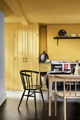
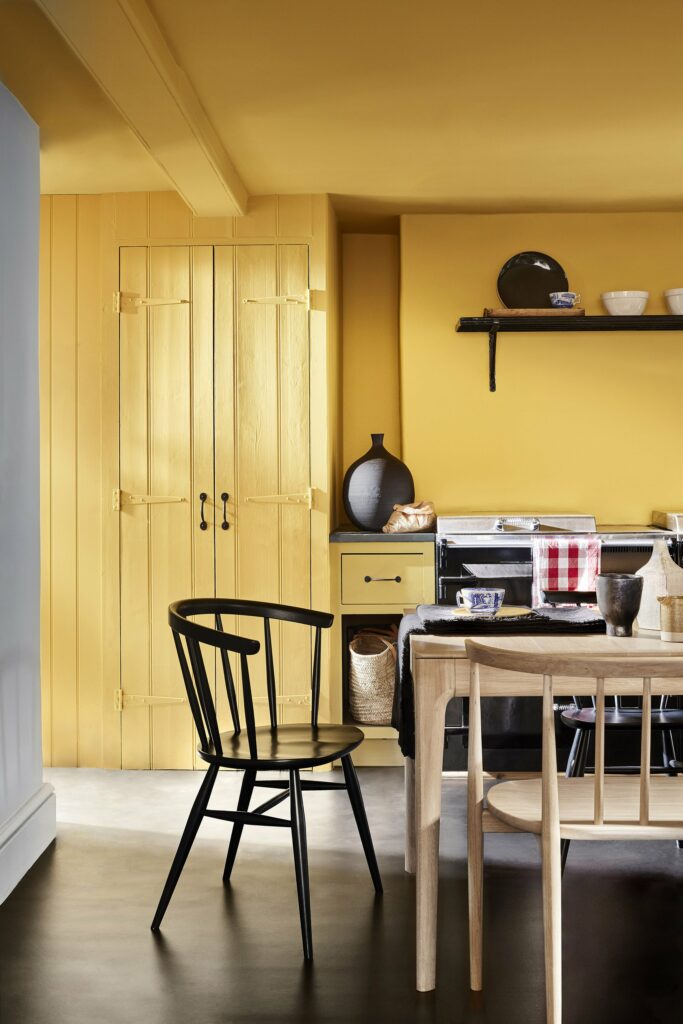
Image courtesy of Little Greene
Ceiling: Giallo 337
Walls: Giallo 337
Cupboard: Giallo 337
Left Wall: Bone China Blue – Faint 325
What paint colours will stand the test of time?
“More than ever, we’ve seen that there is a greater need to surround ourselves with comforting, soothing colours that are not only easy to live with but provide warmth and serenity within our living environments. This has been reflected in the increasing popularity of warmer, natural neutrals, in a clear shift away from the cooler, blue-toned greys that have been so popular in recent years.
These warmer neutrals can be incorporated into both contemporary and traditional homes, with the option to go quite bold or to keep a soft, pared-back design. The use of Stone is not a return to beige, greige or even magnolia, but a new way of using warmer, natural shades in the home to create schemes with longevity.”
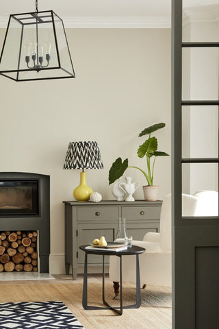 Image courtesy of Little Greene
Ceiling & Cornicing: Portland Stone – Pale 155
Wall: Portland Stone 77
Drawers: Baluster 321
Fire Surround & Crittall Window: Pompeian Ash 293
Which paint colours are perfect pairings if you want to add more than one colour to a room?
“There are lots of wonderful combinations, but I particularly love a bold yet natural pairing. Strong greens like Jewel Beetle are particularly on trend and can be paired with striking tones such as Chocolate Colour to create a real statement. Pairing green with an off-white is also a classic combination, and a soft off-white with a hint of green such as Pique ties fabulously with these dark statement green tones. Pink and green is another classic, natural combination, like a flower and leaf. It’s easy on the eye and provides a level of gentleness and tranquillity.”
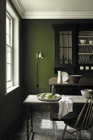 Image courtesy of Little Greene
Wall: Jewel Beetle 303
Dresser: Chocolate Colour 124
Ceiling: Pique 299
How can you introduce a bold paint colour into your home in a way that won’t quickly date?
“A great way to introduce deeper shades in neutral schemes is by colour blocking. You can use a deeper shade alongside a paler neutral to balance the room and add an interesting contrast, and richer, deeper colours can help to bring out the undertones in paler shades. Consider painting the deeper shade at the bottom of a wall and the lighter shade above, to draw the eye upwards. For example, use Arras with the softer Rolling Fog.”
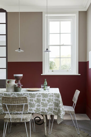
Image courtesy of Little Greene
Ceiling: Loft White 222
Upper Wall: Rolling Fog – Dark 160
Lower Wall: Arras 316
Crittal Window: Rolling Fog – Dark 160
Right Window Trim: Loft White 222
Can you recommend creative ways to add pops of colour to your home?
“There are so many interesting ways you can use paint to create a dynamic scheme. Use a softer shade on walls and highlight architectural features in a deeper, bolder shade, such as painting above or below the dado rail, the ceiling roses and cornices. If those details aren’t present in the home, you can paint the ceiling alone, which will draw the eye upwards and give the illusion of height.
Oranges and bright and bold pinks are truly eye-catching colours when used in an interior. This makes them a fantastic tool for highlighting architectural detailing or creating design interest. You don’t need to paint the whole room to create eye-catching impact. Use the dramatic bright pink Leather as a highlight colour above a picture rail alongside peaceful Pea Green, or pair the playful orange Marigold as a highlight stripe combined with cool Grey Teal.”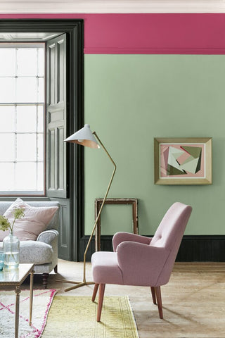 Image courtesy of Little Greene
Cornicing: Slaked Lime 105
Highlight Stripe: Leather 191
Wall: Pea Green 91
Skirting and Panelling: Obsidian Green 216